November 26, 2012
Pie and bar charts in ReQtest
We purposefully ensured that using ReQtest and with only a few mouse clicks, you can create diagrams and charts that are not only beautiful looking but also very powerful. Bring them along to the next meeting for a greater understanding of the metrics at play in your projects.
Diagrams and charts are excellent aids for decision makers such as test leaders and project managers to make the right decisions about releases based on factors such as risk and quality.
ReQtest helps you visualize this data and present it in a usable fashion.
Diagrams and charts are never far away. Anywhere you see a list of requirements, test cases and bug reports there is always a tab called charts, ready at your service to dish up the data in visual format.
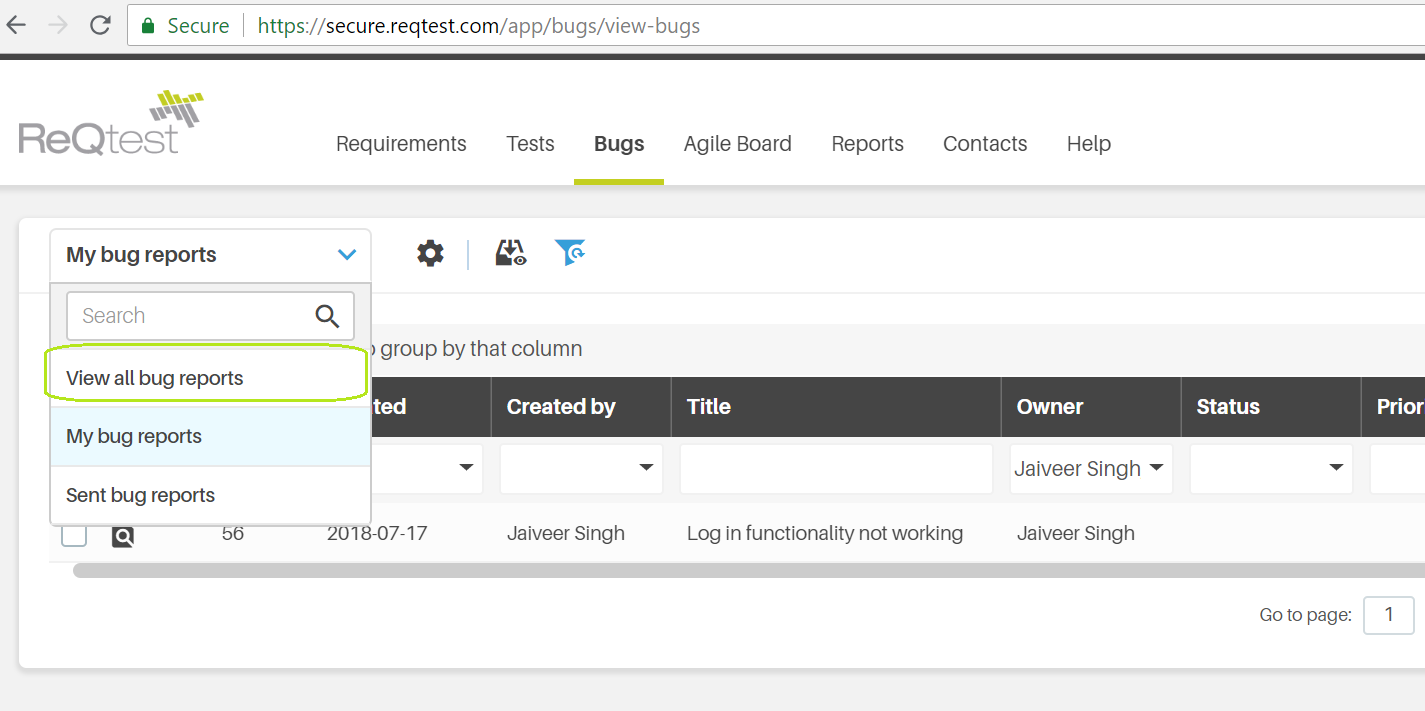
All the parts of ReQtest work in a similar manner. To view the charts you need to click on the ‘Reports’ section in the main menu and then click on Bugs tab as shown in below screenshot:
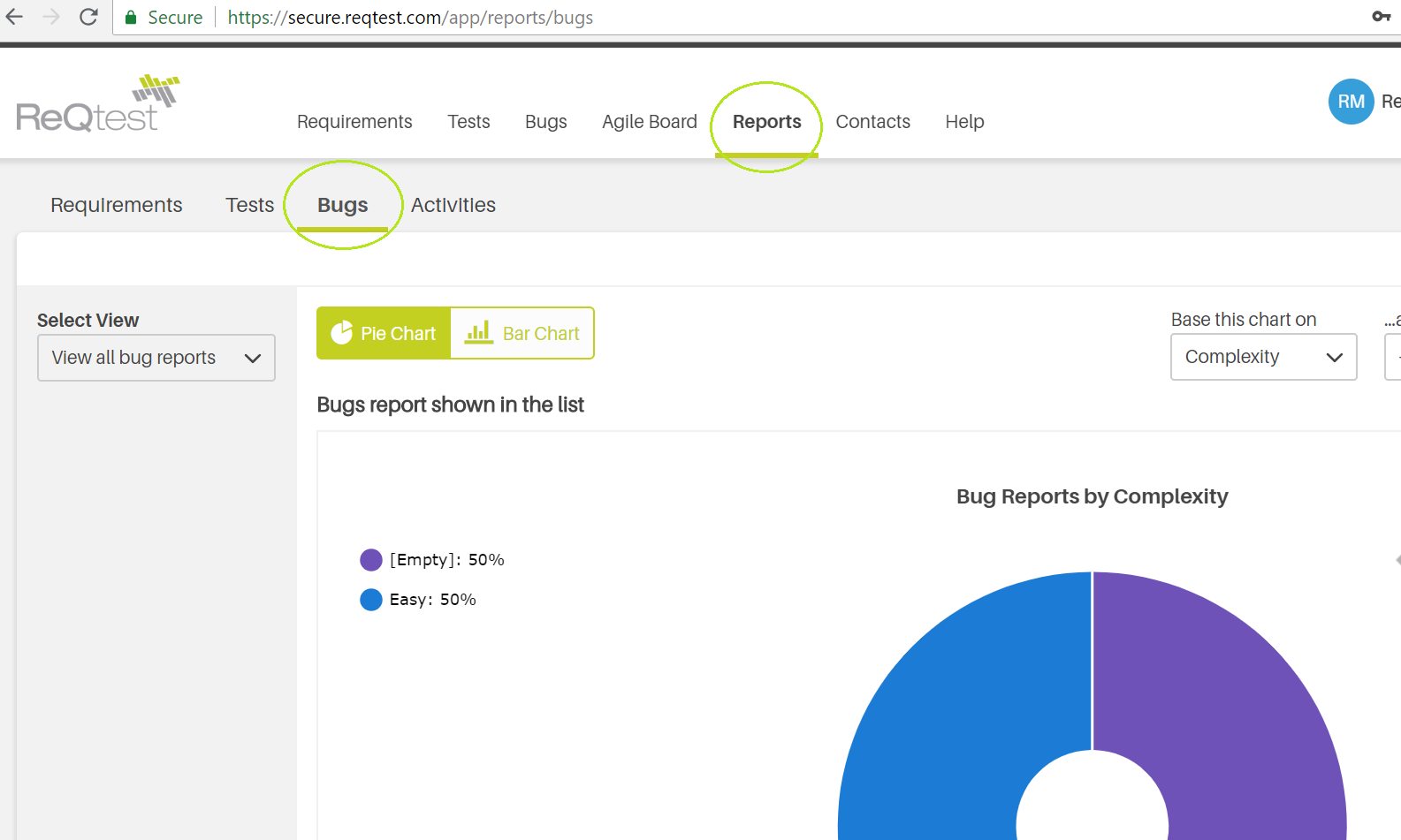
Click the Chart tab, and immediately a pie chart is rendered, which you can then set to display according to the data or parameters in your bug reports.
If, for example you want to know who has created what number of bug reports, or ‘bug reports per subsystem’ or ‘open bug reports per priority and subsystem’ you can easily configure only this data to be displayed in the dropdown.

The chart always displays the data you have chosen in the list. If you want to create a chart of a subset of the data, you simply apply a filter to the list and then switch to the chart.
Typical situations where this comes in handy are when you want to see ‘bug reports per subsystem’ or ‘open bug reports per priority and subsystem’. The filter you apply will immediately be reflected in the chart.
In the image above, we simply filtered out all bug reports created by Oscar, then changed the chart from pie to graph so that we could see which bugs Oscar created and what type of bugs they were.

If you’re looking at the graph and you switch back to the data view by clicking bug reports, you will be shown the data as filtered for the chart, so in this case, once again you’d see Oscar’s 6 bugs.
Once again looking at your chart, scroll down and click on a cell in the table below the chart.

Upon clicking, you will be taken to a list which displays the concerned bug reports. This makes it easy to drill down in the data to get even more insight.
Now let’s assume that you’re going to be using this particular chart quite frequently and want to save time. This is very typical since many users run the same queries over and over again, for example when preparing for a weekly team meeting.
Simply click the ‘Save template as…’ button on the bottom left of the screen and you’ll save a template of this chart, which in our case we will call “Oscar’s bugs per type”. You can create several templates and easily choose the right template from the dropdown menu called ‘Template’.
Watch a video on how to do all of the above right below the fold –
Share article