August 12, 2014
More power with a digital board – Why we love our ReQtest Agile Board
In the May release of ReQtest we added an agile board to ReQtest. As with all features, we “eat our dog food” and use the agile board in ReQtest in our daily work.
In fact we often are even one step ahead and possibly eat some barely-cooked dog food. We currently keep our own agile board in our test environment so we can try out features that are still under development, before we release them to our user base. This way we ensure that the UX is good and that any new features work well with actual data, for actual real life use cases. In some cases, for example, the UI design that we had developed using mockups and wireframes turned out to have serious deficiencies when a lane had more stickies than we had expected. Lesson learned!
Our previous agile board was a physical one, with yellow sticky notes on a whiteboard. When we migrated to the digital board in ReQtest, we suddenly gained new abilities. In this blog post I will describe how we have ended up utilizing the extra features that the agile board in ReQtest gave us, compared to the physical one.
Colour coding
We used to place colour coded stickies on our physical board: green for “normal” development tasks, red for testing, and yellow for tasks that were discovered and added while the sprint was underway. This helped us figure out what kind of tasks we tended to forget or not foresee in our sprint planning meetings.
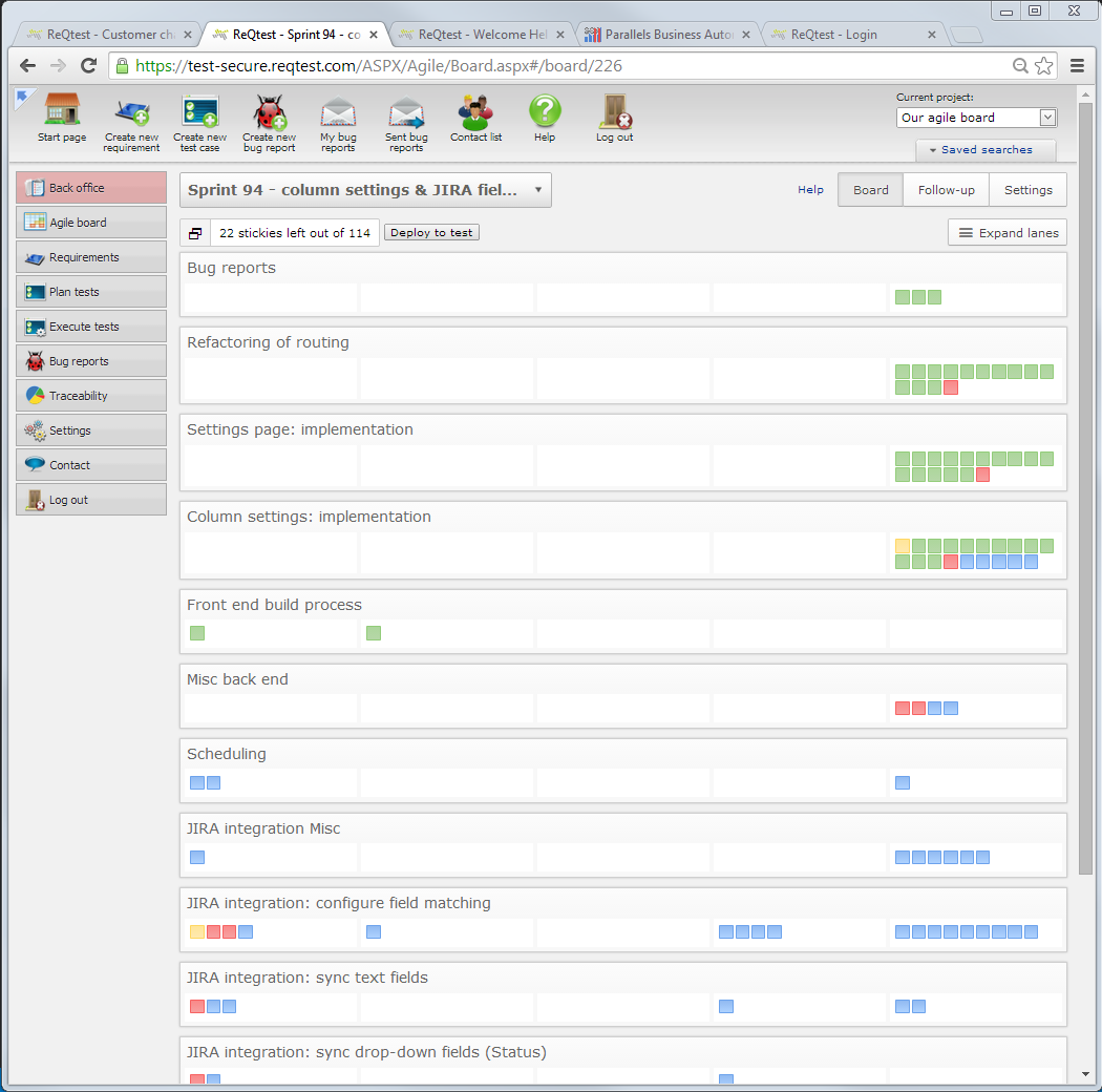
We still use colours in the digital board as well, but after a few months of getting used to the digital board, we completely changed what information we use the colours for. We now use colours to indicate which part of the team is responsible for a sticky: green for front end, blue for back end, red for testing, yellow for other work. This makes it really easy for each developer to find the next appropriate task to work on.
With the addition of the “mini-sticky” view for collapsed lanes (from the June release) this is exceptionally useful for gauging team workload. Already during the sprint planning meeting we can compare the amount of green stickies to the amount of blue ones and immediately notice if the sprint is skewed to one side – and maybe adjust our goal for the sprint, and the requirements we include.
Reprioritizing
On the physical board, changing priorities was hard. If a high-priority issue was discovered in the middle of a sprint, there was no easy way to put it high up on the board. Over time we started leaving some empty space at the top, just in case. Likewise if a certain requirement turned out to be more work than expected and we wanted to down-prioritize it, moving things around on the board was really time-consuming. Often we just didn’t, and used arrows or numbers on the whiteboard to indicate changed priorities.
A digital board meanwhile makes it really easy to move things around. Dragging and dropping lanes and stickies is a moment’s work. We often shift lanes and stickies around as we find out more about the work we need to do to implement a given requirement. We are also much more likely than before to split lanes and stickies to clarify our planned path.
Commenting
The digital stickies may be smaller than physical ones, but they can contain a lot more text. Especially if you want the text to be readable! Not all developers are gifted with tidy handwriting.
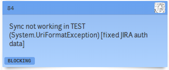
Our tasks usually have quite brief descriptions to begin with, but as we start working on them, we often add more detail: anything from file paths to class names, questions, problems etc. Sometimes if a sticky is left in “Started” overnight we note down what part has been done and what’s still left to do.
We also comment on the stickies when we review them. The way we work, every task on the board needs to be reviewed and approved by another developer before it is moved to the “Done” column. If the reviewer thinks that there are improvements to be made, he or she moves the task back to “Started”. The original developer is then expected to fix the problems and move it forward again. But what problems did the reviewer find?
When we used the physical board, we either emailed our review comments to each other, or attached another sticky on top of the original with a brief and often cryptic summary (because that’s all there was space for). Now we just note our comments directly in the sticky itself. This has really reduced confusion and miscommunication.
This is of course a somewhat temporary solution. In a future release we intend to add proper commenting to tasks. But even the current simplistic solution is more powerful than pieces of paper on a wall.
No going back
We really liked our old physical agile board. It was big and visible, easy to use, and provided us with a nice place to gather for our daily scrum meetings. Honestly, we weren’t too happy about the prospect of giving it up for a digital solution, because we expected the early iterations of our digital board to be inferior.
After just a few sprints we grudgingly admitted that perhaps it wasn’t so bad after all. And once we got the collapsed mini-sticky view in the June release, I as a scrum master was working much more productively with the digital board than I ever could with the physical one.
Now we don’t miss the old board even the slightest bit, and there’s no one who wants it back.
Share article