September 11, 2016
Agile Reporting – A Guide to Effectively Use Different Types of Reports
Before starting to explore agile reporting I would like to ask a question. What is the one thing that Test Managers, Project Managers, Programme Managers, Scrum Masters are wary of? What gives them harrowing nightmares?
You have three choices:
- Reporting
- Reporting
- Reporting
Yes, that’s the right answer! Reporting.
Why, you ask? Let me tell you why.
Outside of a select few who work with truly Agile organizations, the rest of us work in an environment that is a blend of Waterfall and Agile. You could be managing a truly Agile team, yet be part of a wider more Waterfall setup. That brings with it the pain of Waterfall-type reporting.
Or worse, you’re managing pseudo-Agile and quasi-Agile projects, or even downright Waterfall-in-Agile-clothing ones. That brings a whole lot of other pain, and I would highly recommend you try to get yourself out of this trap.
“What better way than to use the facts as of a few minutes ago to make informed decisions about your team’s next most important priority?”
Whatever your situation, you need to satisfy the information needs of key stakeholders. And most often, such stakeholders tend to be far removed from your project/team day-to-day, yet need critical information; information that will help them make decisions that have deep-reaching impact on your team, project, or the wider organization.
You also need on-tap reports you can use to manage your team effectively. What better way than to use the facts as of a few minutes ago to make informed decisions about your team’s next most important priority?
Agile offers plenty of options for generating useful and meaningful reporting metrics. Today, we’ll explore a few fundamental reports/metrics that every Agile project should track. Before we begin, however…
Why do we need Agile Reports?
The answer should be obvious by now. Let me elaborate nonetheless.
Most organisations still employ an annual or half-yearly planning cycle to achieve targets. For IT, this implies finalising and approving a backlog of IT work at the beginning of a year. Through the year, you are no doubt familiar with the myriad number of reports that start at project level and roll up to programme, department and ultimately the IT enterprise level for your line of business.
The powers that be don’t have the time or inclination to observe your project or programme from close quarters. They do not monitor progress day-to-day. They want a snapshot of how a department, programme and all projects that roll under them, are doing at a given point in time. This helps them observe, approve and manage funding, resource allocation, and track against annual plans at enterprise, department, programme-level.
So reports are necessary.
Reports provide visibility.
If you are running an important initiative, you use reports to broadcast how well your project or programme is doing.
If you are facing challenges, risks, issues, then you use reporting to bring this to management’s attention – so you can get the help you need.
If your team are doing a good job, your reports will reflect this – and get you and the team the rewards you deserve.
And like I mentioned earlier, you also need reports to manage your team/project better. Reports help you regularly monitor your team’s progress against goals.
Your regulators, auditors, senior management – all of them look for reports to understand progress against goals and targets.
Introduction to Agile Reporting
I’m not going to elaborate on the Agile framework itself here. You can use the wealth of knowledge about Agile available on the ReQtest blog to brush up.
1. Sprint Burndown
At a Sprint-level, the burndown presents the easiest way to track and report status (the proverbial Red/Amber/Green), i.e., whether your Sprint is on or off-track, and what are the chances of meeting the Sprint goals. The burndown chart – when used right – can provide near-real time updates on Sprint progress.
“If your team do it right, then they would take in just the right amount of work into a sprint.”
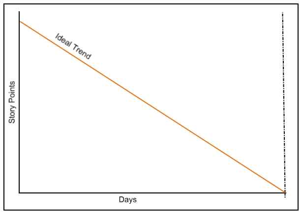
At the beginning of a Sprint, the Scrum team perform Sprint Planning and agree to take on development work worth a certain number of Story points. This forms the basis for the Sprint Burndown chart.
The total story points agreed at the beginning of the sprint make up the y-axis, and the individual dates in the Sprint make up x-axis. If your team do it right, then they would take in just the right amount of work into a sprint. And if everything goes well, the burndown trend will look like this:
Of course, not all sprints are made equal. So actual Sprint Burndown may not look as perfect.
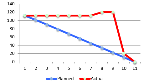
For instance, Scrum teams are prone to overestimate their ability to deliver during their first development Sprint on a new project. Or if they are a newly formed team. Or if they are learning to work Scrum. In such cases, it’s quite possible that the team fall behind schedule. The burndown chart helps bring issues to the surface:
As you can see, this particular team needed a spike late in the Sprint to catch up. This is not uncommon, and the reasons could be many – the team overestimated, or development stalled due to technical constraints. Ideally, such trends should be avoided.
2. Sprint Velocity
This metric goes hand in hand to help your team achieve ideal Sprint burndown.
How?
In simple words, Sprint Velocity represents the average number of story points a team can take on for a Sprint. This number is based on observing how many story points were delivered during the previous two to three Sprints, and simply calculating the average story points delivered per sprint.
When you know your team’s velocity, it is then going to be easy to manage how much work they can commit to at the beginning of a Sprint. Keeping track of Sprint Velocity will help you and your team avoid situations where you need to reduce or change scope mid-sprint – which may not make them (or you) look good.
The obvious limitation with Velocity is that you need at least two to three Sprints’ worth progress before you can identify a trend.
When it’s too early to know your team’s Velocity.
During the first few sprints, I try to avoid the off track scenario (like in Figure 2 above) by looking at velocity from past Agile projects my team have been part of.
Where velocity data is available for past (similar) projects, and if the team are experienced enough in Agile to employ consistent story pointing across projects, then you can begin new projects like a boss, and get the team to accept reasonably accurate story points right from the get go.
Again, velocity can differ between projects – even for the same team. So while this technique might improve accuracy in Sprint Planning during the first few sprints, it is not fool proof. So there’s that.
3. Epic, Product and Release Burndown
We know now that Sprint burndowns help you track status at Sprint-level. Epic, Product and Release burndown charts provide a similar utility.
As with Sprint burndown, Release-level burndown charts help you understand when you can expect to deliver a given scope. And again, note that the accuracy of the burndown improves with time, as the team deliver the first few sprints.
“It is quite rare for Agile projects to have the entire scope nailed right at the beginning (like Waterfall), so learn to accept spikes as a matter of course.”
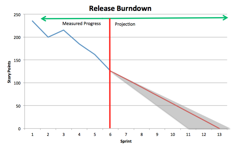
As you can see from Figure 3, the sample release burndown is not an ‘ideal’ trend line like Figure 1. Around Sprints 2 and 3, the team have (seemingly) added new requirements to the release backlog. This has led to a spike in the blue line around sprint 3, before settling back to a more stable burndown trend.
Any experienced Agile practitioner will tell you such spikes in the burndown trend line are quite common in real life Agile projects. By nature, Agile allows you to groom the backlog regularly to increase or decrease scope. It is then only natural that such grooming reflects in your burndown charts. It is quite rare for Agile projects to have the entire scope nailed right at the beginning (like Waterfall), so learn to accept spikes as a matter of course.
Or, Use Burnup Charts instead
There are limitations with Burndown charts. They don’t bring out issues such as scope creep as clearly for all stakeholders to understand.
Why is this important?
Let’s take the release burndown depicted in Figure 3 earlier as a case in point. The spike around sprint 3 depicts what looks like a bit of scope creep. This has led to a not-so-straight trend line, with a projection that is delivering noticeably later than the team could have before the spike. The impact of the change in scope isn’t entirely clear to an onlooker.
For a senior stakeholder that sits outside the project, it may not be immediately apparent that the team are doing more than they set out to plan. Therefore, the causes for any delays in the project schedule aren’t understood as well as they could be with better information.
A burnup chart could help you here. Let’s see how with an example:
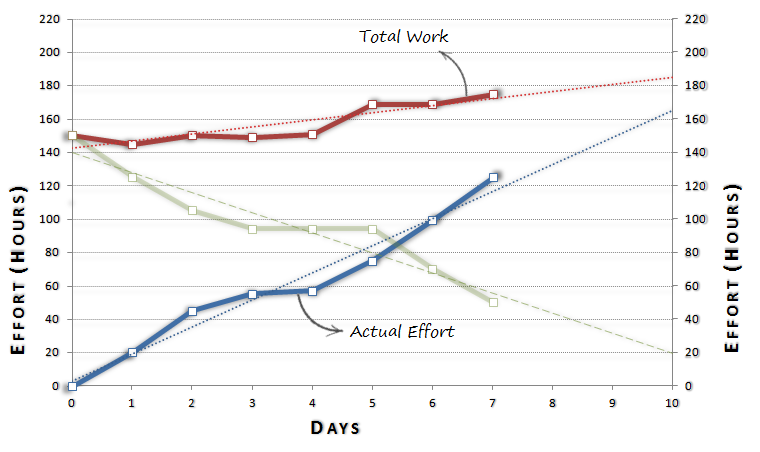
A burnup chart plots two key pieces of information – total work (hours, story points etc.) and completed effort (progress against total work). In the example in Figure 4, you can see that the Scope (i.e., total work) changes constantly (red line). In fact, it is expected to have changed as much as 30% by the end of the iteration (sprint).
You can also see that actual effort has progressed steadily along the blue line. From a quick glance, the following will be clear to anyone:
- The scope of work for the iteration (sprint) has changed by as much as 30% through the iteration.
- The team set out to deliver 140 hours’ effort, and are on track to deliver 160 – i.e. they are delivering about 15% more than they originally committed.
- Despite the increased productivity, the team will still fall short of the (changed) scope for the iteration (sprint).
What possible actions could be considered?
- Better scope management – so the team don’t have to factor changes day-to-day, and therefore lose effort in realigning with new scope constantly.
- Better upfront iteration (sprint) management – so the product owner can work with the team more effectively to produce a more concrete sprint backlog at the beginning of the iteration (sprint).
Now, could you have surmised all that with just the green line in figure 4, or the spike in the blue line in figure 3? Highly unlikely. That is the power of the burnup chart.
Choose burnup or burndown mindfully – or better yet, choose both!
When your release/sprint scope isn’t stable enough, switching from a burndown to a burnup chart will help you identify and report risks and issues more effectively. If on the other hand, your backlog is pretty stable up front, and you don’t see the scope changing regularly, burndown charts will be sufficient to report progress.
4. Earned Value
Now this is one of the Agile reporting techniques I am just a little hesitant to recommend.
Let me explain.
If you don’t know Earned Value reporting, it’s basically about measuring whether the amount of money spent through so far in your project justifies the amount of work completed at this point in time.
There are a few variables here:
- Budget – the estimated cost of your project. This is usually decided at the beginning of the project, and reviewed infrequently or not at all.
- Actual cost (AC) – the proportion of the original budget your team have spent so far.
- Planned Value (PV) – the proportion of your project scope that was expected to have been delivered by this time.
- Earned Value (EV) – the ‘real’ value of the scope that has actually been delivered so far.
Let’s consider the sample EV graph below:
At t1, the team has delivered more Earned Value compared to budget spent (Actual Cost), so EV > AC.
At t2, the team has delivered less Earned Value compared to budget spent (Actual Cost), so EV < AC.
What does this imply?
Not much, really – or a lot, depending on your situation.
If for example, you’ve technically only delivered 50% of your project scope but already spent 60% of the original budget,
- This could mean your team aren’t efficient – after all, you’ve spent more than you earned.
- It could also mean you budgeted incorrectly in the beginning – being Agile and all, the initial budget would have been a ballpark estimate.
- Again, it could be that your team have completed much foundation work during the initial phases of the project that ultimately, EV will catch up to AC.
- Or, your scope could have changed substantially to justify the additional spend (re-alignment) at the given point in time.
Unless you truly understand the root cause of a variance in EV vs AC, it will be hard to judge whether your Earned Value at a point in time is acceptable. Especially given the nature of Agile projects in general, it is unfair to expect the level of certainty necessary to get budget and scope right up front.
So use this metric – if only to keep an eye on how much money your project is spending relative to progress. Just don’t rely too much on it – it might take you back to Waterfall. Which isn’t a bad thing in itself – however, be careful not to confuse Agile and Waterfall.
5. Scope Change
This is a bit of an oxymoron. By nature, Agile projects should be open to scope change. Right? Right?
Yeah, not so much.
If your project is in churn all the time, you’ll find your team constantly working to re-align with new requirements, dropped requirements, changes etc. If the project scope reduces significantly as part of all this churn, it could mean you can deliver earlier than planned. If on the other hand, there is significant addition to scope or if the scope has changed so much you need a lot of rework, then all of a sudden, your project could be in the red because the original schedule now looks like Mt. Kilimanjaro.
So what do you do in such scenarios?
You report the changes to scope regularly, of course. Agile projects can absorb changes to scope. They should also report such scope changes diligently.
Did your Product Owner drop Feature number 4 mid-flight and bring in a Feature number 6 that costs twice as much – in time and money? You need to report this so you can secure the additional funding and time necessary to absorb the changes.
By reporting Scope Changes, you demand a certain level of responsibility on the part of the Product Owner. They have the responsibility to think any significant changes through before these are introduced to the project, so they can be prepared to answer any questions about cost/scope creep.
6. Defects Trend
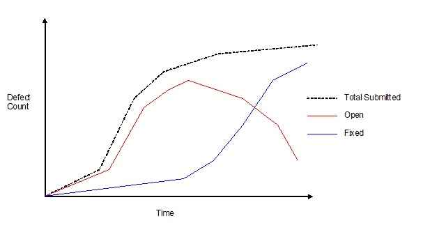
Plot defects as they are identified, their resolution and those that remain open on a graph, and you’ll have yourself a visual Defects Trend chart. Defects Trends are useful in tracking defects resolution for a release or product as a whole.
Not all defects may be fixed within the Sprint or Release they are identified. Some (usually non-blocker defects) tend to get carried into future Sprints or Releases.
Plotting and tracking the Defects trend will help your team in a number of ways:
- You can manage code quality as you get closer to a release.
- The trend will help you decide if you need a Defects spike.
- Making defects trends visual brings a sense of urgency and accountability among developers, who will (hopefully) work to improve code quality.
7. Team Capacity/Load
Whether you’re starting out with Agile Transformation, or if you’re at various stages of getting there, the most challenging Agile tenet is not having team members spread on multiple projects.
“Even more challenging is to know if everyone in your team is working to optimal capacity.”
While Agile doesn’t allow sloths to survive – it exposes them eventually – we’re not talking about work shirkers here.
You do genuinely need a way to know – at any point in time – what everyone in your team is up to. The Team Capacity/load dashboard can help with providing you a snapshot of your team’s workload.
How does it work?
For each team member on a project, capture the following information:
- Total capacity in hours = number of hours per day that they are able to dedicate to the project multiplied by number of days that they are allocated to the project.
- Assigned capacity in hours = number of hours (or story points multiplied by average number of hours per story point for the team member’s particular skill) allocated.
- Available capacity in hours = Total capacity – Assigned capacity
Having this information to hand will help manage your team’s allocation better – especially when they are across multiple projects.
Tools like JIRA offer a number of plug-ins to manage Team Capacity/Load online, so you have on demand access to the latest view of work distribution and capacity.
What do your stakeholders look for in an Agile Report?
What single question do you need to answer with all your reports?
Simple: Are You On Track?
This is almost everything anybody that consumes your report, wants to know. Almost.
Agile or Waterfall, whatever metrics or report templates you use, you are trying to report on this one super-metric. Remember – as long as your reports provide a visible and clear answer to this question, you will have done your job. All else is either exceptional or supporting information, or just plain background noise.
“Almost all the Agile or scrum reports above can be set up once, and generated on demand in a matter of seconds or minutes.”
And Finally, the Good News
You don’t need to spend hours and days for agile reporting. Depending on the level of tooling employed by your team, almost all the Agile reports I’ve outlined above can be set up once, and generated on demand in a matter of seconds or minutes. If you then need to export/copy to a presentation-worthy PowerPoint or PDF template, that’s simple too.
Take time early on in your project to establish the metrics you need to report on. And take the pain to set up the right Agile dashboards that capture these metrics effectively. From there, it’s just child’s play.
What did you think of this article? Do you have any other Agile reports/metrics that you extensively use? Share your thoughts in the comments section below, and let’s discuss.
Share article
